
A good logo should feel fun and fresh and leave you with a smile, like a good taco.
Crafting a tasty color palette
The mouth-watering color palette was chosen to bring together the core flavors of the brand. Anchored by earthy browns and a bold and spicy orange, the palette is wrapped in a warm shade of beige, with a dollop of green as an accent.
Carne
rgb: 117/76/41
cmyk: 39/64/89/35
hex: #754C29
Queso
rgb: 246/148/31
cmyk: 1/49/99/0
hex: #F6941F
Frijole
rgb: 35/31/32
cmyk: 70/67/64/74
hex: #231F20
Tortilla
rgb: 237/240/218
cmyk: 1/0/9/6
hex: #EDF0DA
Guac
rgb: 100/144/113
cmyk: 31/0/22/44
hex: #649071

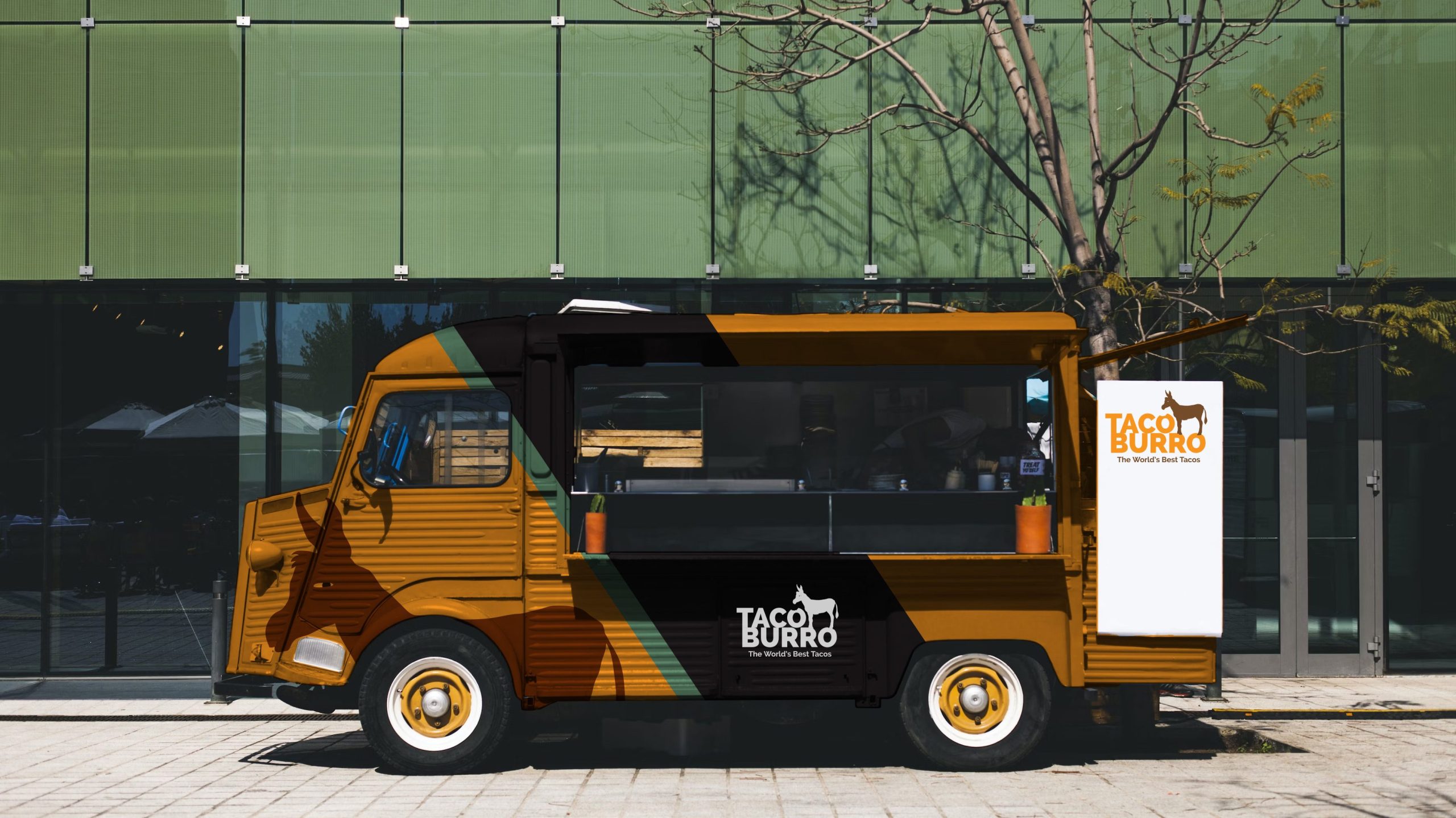
Taco truck wrap mockup
This mockup shows how the logo could be used on a food truck wrap.
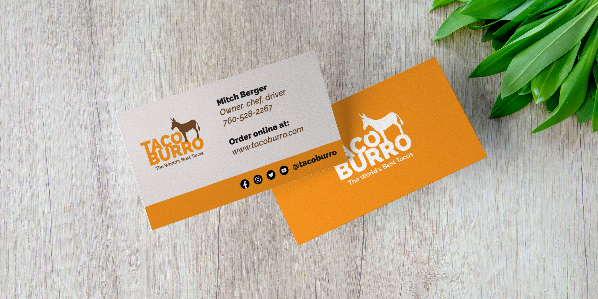
Business card layout
A good logo should look great and be identifiable at both large and small sizes. One of the smallest sizes is usually a business card.
